


I conducted a heuristics evaluation of Splitwise’s web app and re-designed their web app.
Duration: Three months (April 2023 - July 2023)
Responsibilities: Web App UX/UI Design
Quick Links: Low-Fidelity Prototype + High-Fidelity Prototype
Software Used: Adobe XD, FigJam, Maze
ⁱ A Google Slides deck consisting of information gathering and visualisation tools that helped inform my design process.

Splitwise is an application that allows users to track and share the cost of expenses with individuals or groups. It is commonly used by friends, partners or flatmates for shared household expenses or one-off trip expenses. It is available as a free or paid app on iOS, Android and the web.
This app was the cornerstone of my experience living and doing life with friends as a young adult studying in London. For all that the free version of the app has to offer, its accounting wizardry has been sufficient in delivering on its foundational premise. I thought it would be worthwhile to revisit and evaluate an app that has been indispensable to my social circle.
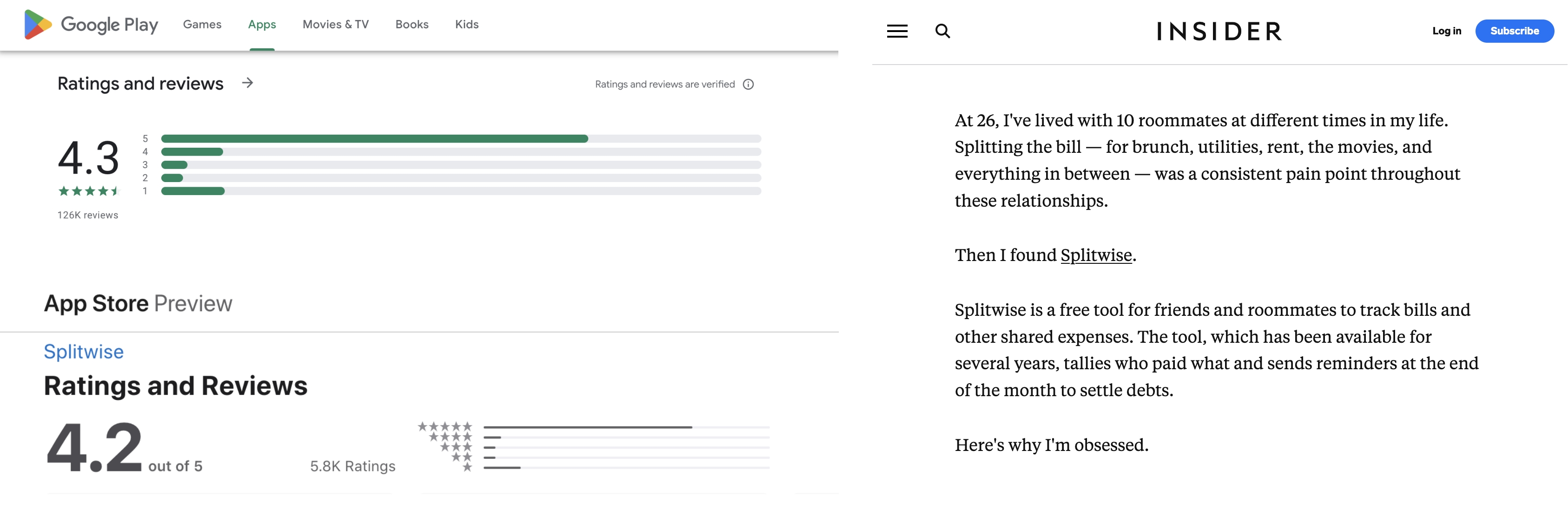
Before diving into the evaluation and re-design of Splitwise’s web app, I did a quick scan of articles and reviews on the app.
Most reviews have been positive ones:
Splitwise has also received head nods from various investors over the years since its founding in 2011. As an affirmation to its potential for growth, they have most recently managed to raise USD$20 million in Series A funding from Insight Partners in 2021.
The app is not without a few sticky issues.
Issues about the app’s usability aside, it is fascinating to note the behavioural aspects of sharing and splitting expenses. Attitudes about money, reciprocity, and lifestyle choices come to the fore. Splitting expenses is not just a math problem to be solved but has become a test of financial compatibility for some.
This article tells a cautionary tale of a friendship imploding after someone had falsely indicated that she had ‘settled up’ a debt. Much to the chagrin of some, we need to admit that even technology cannot circumvent all questionable, anti-social behaviour when it comes to money matters.
For this design project, I decided to take stock of the user flows and the user interface of Splitwise’s web app by conducting a heuristic evaluation. I would then do a re-design of the web app to improve user flows and the user interface.
The goal of this heuristic evaluation is to review Splitwise's web app. I hope to address user pain points encountered on the existing web app and improve user flows.


Figure 1 - 5. Screenshots of Several Web Pages for Splitwise’s Existing Web App — i. Dashboard ii. Group Page iii. Friend Page iv. Add an Expense v. Settle Up
Jakob Nielson’s 10 Usability Heuristics for User Interface Design is one of the two commonly used heuristic guidelines for UX, UI and product designers to evaluate an existing digital product.
I completed a series of tasks as part of the evaluation, ranked the initial issues/problems that have been flagged on a 5-point rating scale before prioritising the issues to work on using a 2x2 matrixⁱ.
While a lot of the features were functional and users would have been able to complete key user tasks, the current user interface obscures some of the features and user flows. It would take a user some time to learn where these features are and how to use the app. Since it was not merely a cosmetic issue, I decided that an overhaul of the web app’s user interface would be on the agenda for the re-design.
It is only fair to gauge how the current web app fares among users so I ran a usability test on it with 5 participants. I assigned the participants a series of 4 tasks using a dummy account I created on Splitwise:
The Task Completion Rate for this leg of usability testing is 95% with the average Customer Effort Score (CES) standing at 4.2/5 (with 1 being Very Difficult and 5 being Very Easy).
The table illustrates the average duration participants took to complete each of the tasks listed above:
Table 1. Average Time on Task for Tasks Completed During Baseline Usability Testing
*The longer Time on Task figure includes the amount of time the participant took to complete the task when he prompted me to give him a hint.
What is missing from the existing user flows? It seems that for an app that positions itself as a shared expenses app, many tasks and decisions can be made unilaterally by individual users.
I proposed one new user flow and made changes to an existing user flow. The new user flow requires users to send requests to friends on the app to settle up. The friend can respond to the request in three ways:
While this increases the number of steps in the user flow to settle up a debt between two friends, it also presents a solution to the problem arising from the original user flow where an individual can unilaterally decide to settle a debt.
The addition of this user flow provides more clarity for both individuals involved in the settlement. Furthermore, it allows for the individuals to verify the details of the settlement and for them to agree on it or to initiate changes.

There were several issues when making a payment with PayPal:
I made changes accordingly to ensure a seamless user flow and to reduce the steps required to complete a payment via PayPal. What these changes entails for the user is that they can skip the “Record a Payment” flow and immediately proceed to send their request to settle up the debt.
(Note: This part of the user flow involves PayPal, an external payment processor, therefore this might constrain what can be done for this suggested user flow change.)

I came up with three design proposals for the new user interface.


Figure 4. Three Proposed Versions of the Dashboard, Group Page and Add an Expense Modal
I proceeded to conduct comparative usability testing using these three designs. Based on the first round of testing and feedback from participants, I made some changes and created one finalised low-fidelity prototype.


Figure 5. Wireframes for the Finalised Low-Fidelity Prototype — i. Dashboard ii. Group Page iii. Add an Expense iv. Respond to a Request to Settle Up v. Record a Payment
You may view the final version of the low fidelity prototype to see how it has evolved from the three initial proposed low fidelity designs.
Working on the high-fidelity prototype was a vital way to refresh the Splitwise brandⁱ. A major part of it was to update the colour palette; I tapped on the original brand colours to inspire a new one.

For the main CTA colour, I decided to use one colour only — a forest green — instead of teal and orange. I used various shades of orange and green to indicate different users and different categories for the data visualisation on the web app.
I built a set of icons that speak to the different actions on Splitwise. These icons were either customised by combining icons from Untitled UI’s community file to form composite icons or taken directly from the file. I also adopted some icons from the Dashboard UI Kit provided by Adobe XD.
For elements that had to be repeated across multiple screens and elements that have various states, I created components out of themⁱ. These components also helped in adding interactivity to the high-fidelity prototype alongside the connections made between the screens to create the user flows as illustrated in Figure 2 and Figure 3.
After completing the first iteration of the high-fidelity prototype, I uploaded the prototype onto Maze. Once again, I reached out to 5 participants to conduct usability testing. As per the first round of user testing, there were two non-Splitwise users and three Splitwise users.
One shortcoming of Maze is that it is not able to display the micro-interactions I had incorporated into my high-fidelity prototype. As a result, the participants were not able to experience the prototype as I had intended for them to.

Nonetheless, I decided to use Maze. The benefits and learning points outweighed the shortcomings. I wanted to run a round of unmoderated usability testing to see how intuitive the high-fidelity design is for participants without my guidance.

Maze provides analytics from two points of view; the first way to make sense of the data was to analyse them block by block while the second way was to follow each participants’ journey through the usability test.

Looking at the data block by block enabled me to consider the indirect successes on the blocks where participants had used alternative pathways to get to the final point in the flow. It was eye-opening as it challenges the assumption I had that I had included all of the possible paths and that users would follow the paths I had indicated.

When I considered the data from the perspective of each participant, it became clearer to me the recurring issues each of them faced through the succession of tasks.
Comparing the numbers from before and after the re-design, there are wins for my version of Splitwise. But there are also shortcomings when compared to the existing version of the web app.
Table 2. Comparing Number of Tasks, Number of Participants, Task Completion Rates and Customer Effort Score (CES) between Baseline and Re-Designed Splitwise Web App
Table 3. Comparing Time on Tasks between Baseline and Re-Designed Splitwise Web App
Taking into account the comments participants gave for the existing web app and the feedback given on the re-designed version adds a different perspective to these numbers. They were able to complete the tasks with more clarity on the re-designed web app as opposed to just clicking away and hoping for the intended outcome to materialise, as illustrated by this particular quote:
Four of the five participants mentioned how profile pictures of other users and iconography served as informative visual cues that aided them in completing the tasks on the high-fidelity prototype of the re-designed web app.
Keeping the user feedback in mind, I made the following changes to the high-fidelity prototype:


The live high-fidelity prototype is available for viewing.
This project has given me a fresh perspective on what it would be like to work on an existing product. This has enabled me to understand the importance of iteration in the design process and product life cycle.
What I took away from completing this case study:
Splitwise has saved my friends and I the hassle from having to amass a pile of receipts, entering them into the group chat, and tracking whether Zac has paid his share of the rent or not. I hope Splitwise continues to roll out future versions of the app that can further prevent hair-splitting moments of tension between people over shared expenses.
